The Client
Remiges
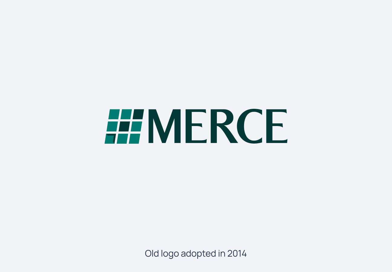
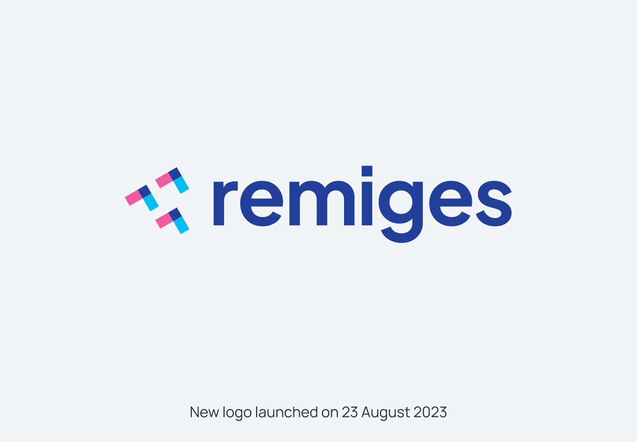
Remiges — the large quill feathers of a bird's wing, the primary and secondary contour feathers that generate lift and enable flight. The name came from the client, chosen at a pivotal moment: the company formerly known as Merce Technologies, nearly two decades into its life, was renaming itself to signal a fundamental shift in ambition. Where Merce had been a solid technology services firm, Remiges would be something with more range — and the name said so with precision and nerve.
The Business
Remiges — the large quill feathers of a bird's wing, the primary and secondary contour feathers that generate lift and enable flight. The name came from the client, chosen at a pivotal moment: the company formerly known as Merce Technologies, nearly two decades into its life, was renaming itself to signal a fundamental shift in ambition. Where Merce had been a solid technology services firm, Remiges would be something with more range — and the name said so with precision and nerve.
The Brief
The brief arrived with the energy of a company that had outgrown its own skin: "Omkar, Merce is turning into Remiges. We are almost two decades old. We want to explore new geographies and shores, we want to take higher flight. Do something quickly, no?" The urgency was real.
The Brand
Omkar Sane and Sane Difference started not with the feather but with the relationship. Merce had spent years moving from vendor to partner to collaborator — evolving from a company that executed briefs to one that shaped outcomes alongside its clients. Remiges was now entering something closer to a symbiotic relationship: growing what helps its clients grow, and growing in turn. The company was both the cause and the beneficiary of every engagement, just as the client was.
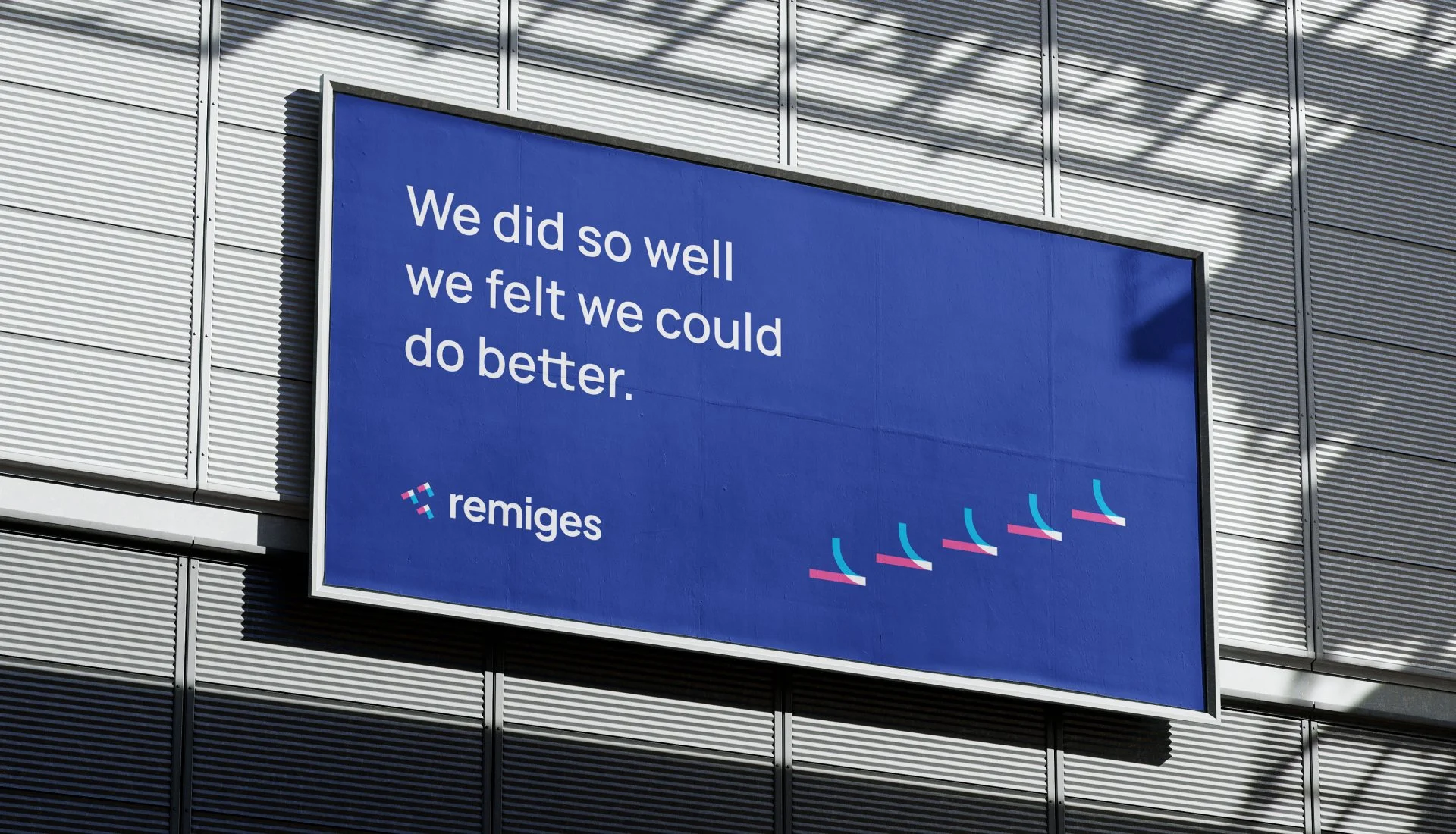
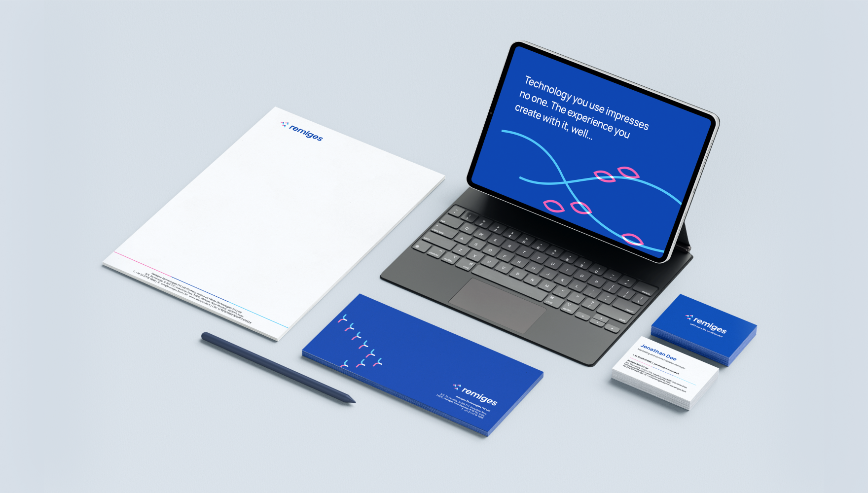
The mark translates this into form. The logo — a set of angled, interlocking shapes in blue, cyan, and magenta — suggests both upward movement and convergence. The forms are directional but interdependent, echoing the feather's structure: individual barbs that lock together to create a surface capable of flight. The colour palette breaks from the safe navy-and-grey register of most enterprise technology firms, signalling that Remiges intends to be recognised, not just respected.
The Brand World
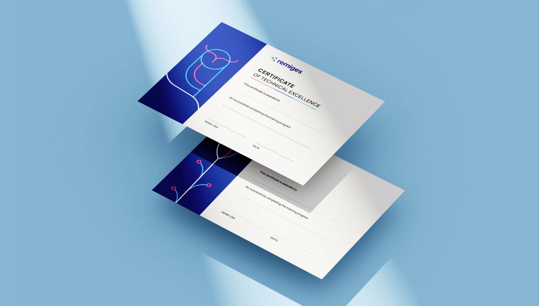
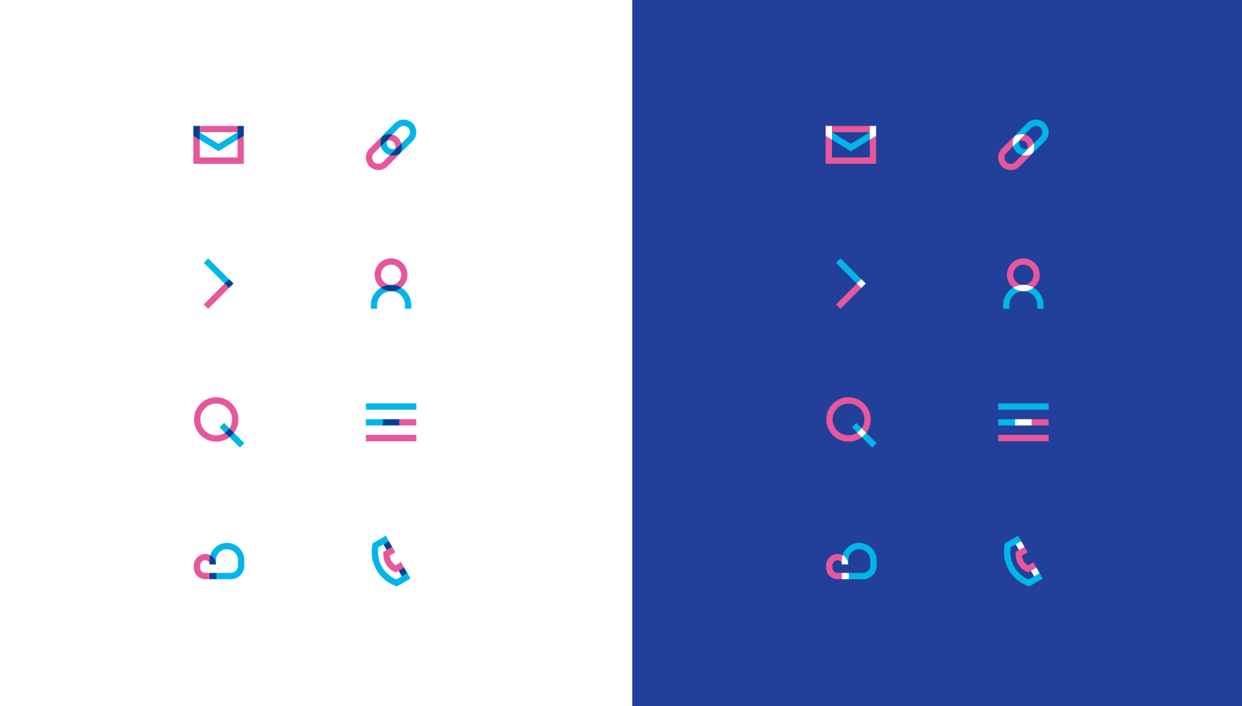
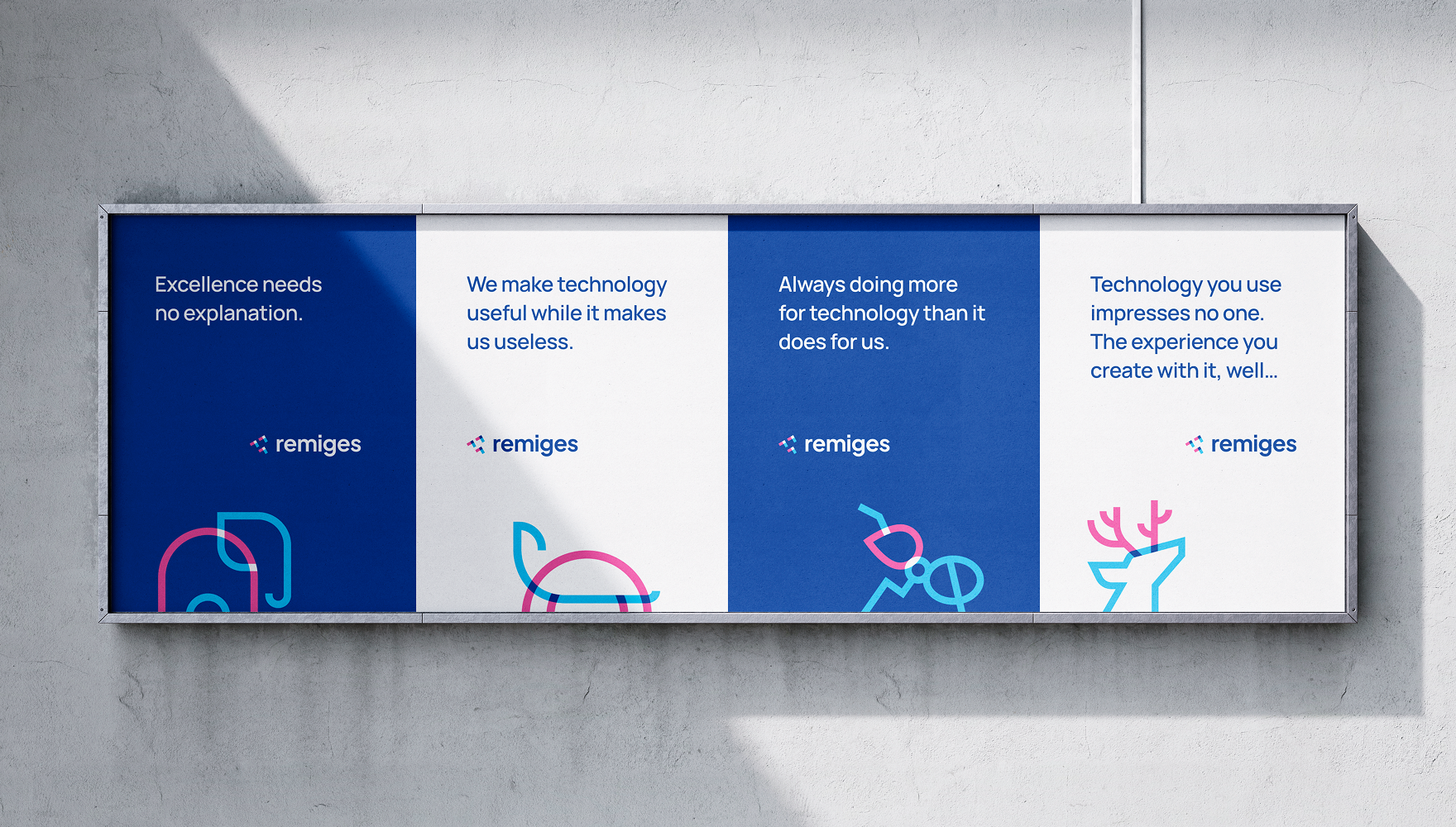
The identity extends into a custom icon language developed for Remiges's core values — fairness, technical excellence, collaboration, ownership. Each icon is constructed from the same geometric primitives and colour palette as the logo: open arcs, angled forms, and interlocking shapes in blue, cyan, and magenta. The icons don't illustrate their concepts literally; they enact them through the same visual logic that governs the mark — parts combining, connecting, supporting each other.
The Website
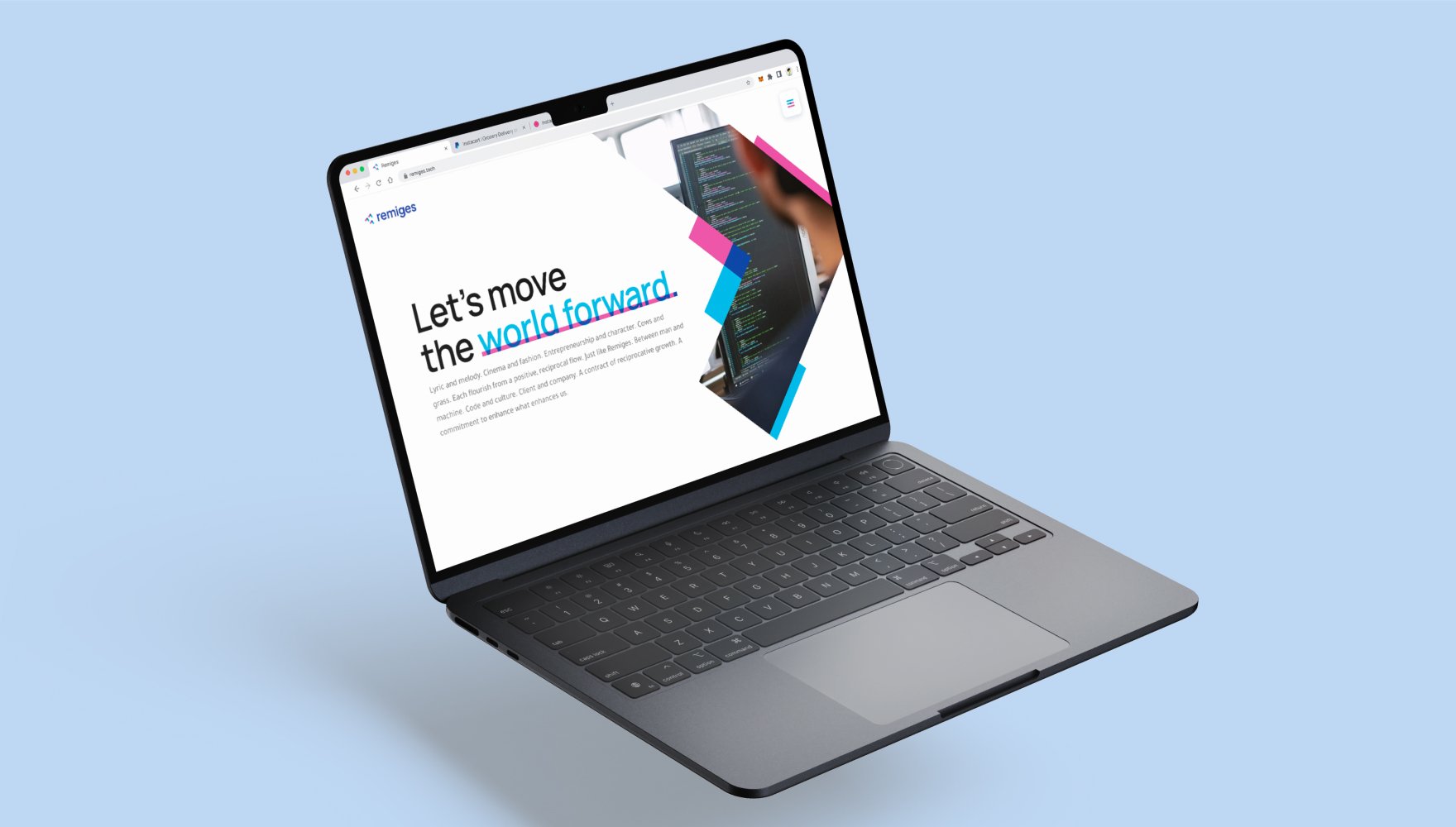
The digital platform organises seventeen years of programming, speakers, paper submissions, and past sessions into a clean, content-first interface. It privileges the conference's intellectual substance over decorative convention — the architecture serves researchers submitting papers, participants navigating schedules, and newcomers understanding what EMC stands for. The site carries the building-block identity into digital space without reducing it to surface decoration, functioning as both an archive of the conference's history and the public face of its future.