The Client
XKDR
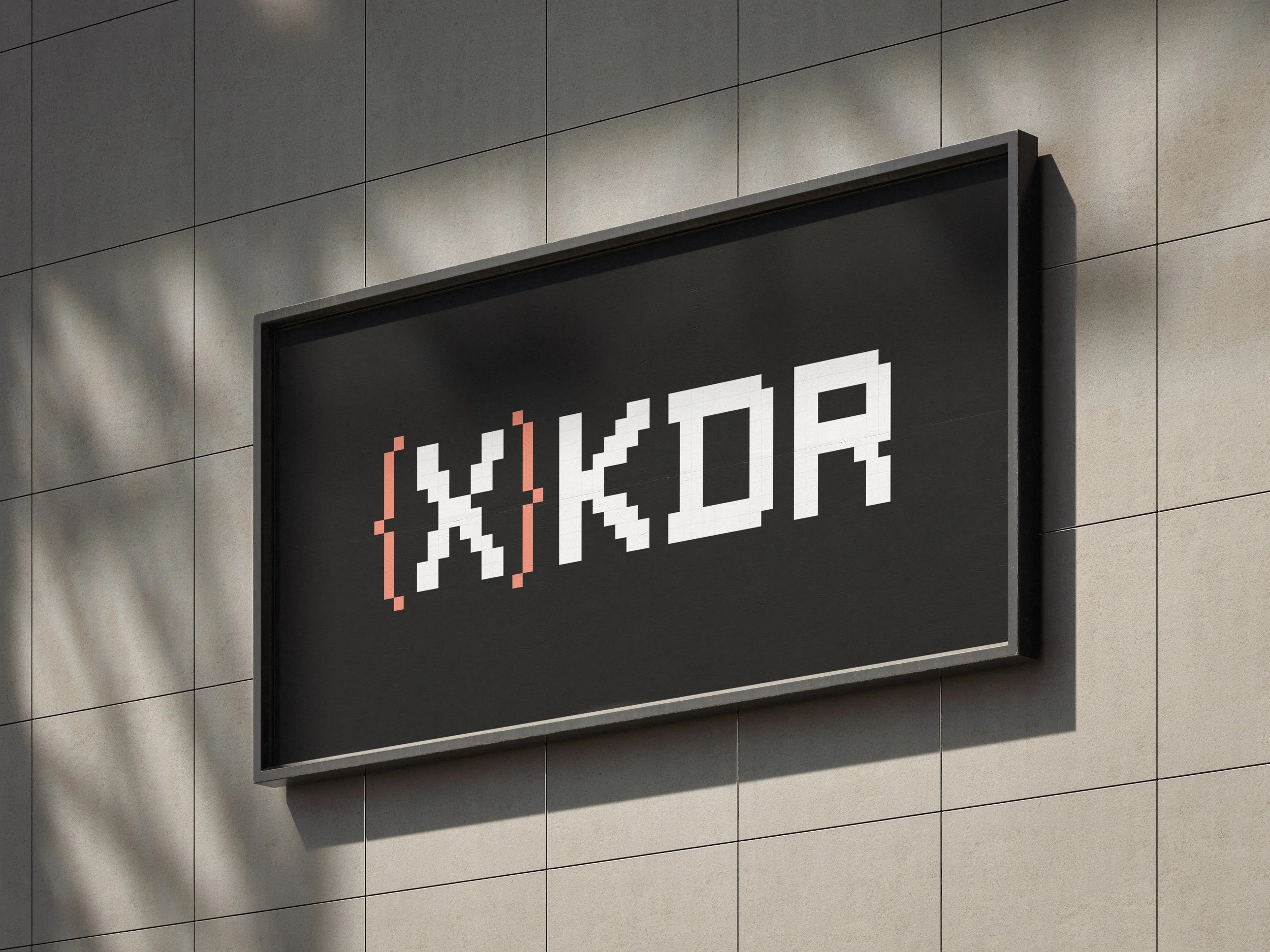
XKDR — where X stands for Cross Disciplinary and KDR for Knowledge Data Research. The name came from the client. It reads like a formula, which is appropriate: the organisation was founded by researchers who think in models, data, and evidence. The design task was to make a name built from abbreviation feel like a living identity.
The Business
XKDR Forum is a Mumbai-based non-profit research organisation whose approach is inter-disciplinary by design, harnessing economics, law, public administration, engineering, statistics, and science to create new data and knowledge. They write papers and books, build data systems, host conferences and seminars, and engage in public debates — but not in a partisan or ideological manner.
The Brief
When Omkar Sane first encountered XKDR's existing website, he called it a dhobi list — a laundry list of outputs with no organising idea, no visual identity, no sense of what the institution actually stood for. Ajay Shah and Susan Thomas didn't disagree. The brief asked for an identity that could hold all of what XKDR is — the intellectual seriousness of a research institution, the accessibility of a public-facing platform, and the cross-disciplinary restlessness that makes it difficult to categorise by conventional standards.
The Brand
The starting insight was that research is, at its core, an act of looking closer. It means digging into details. And today, almost all research — writing, modelling, reading, publishing, debating — happens on screens. Every screen is made of pixels. A pixel is the smallest unit of detail, a microscopic way of hunting for answers.
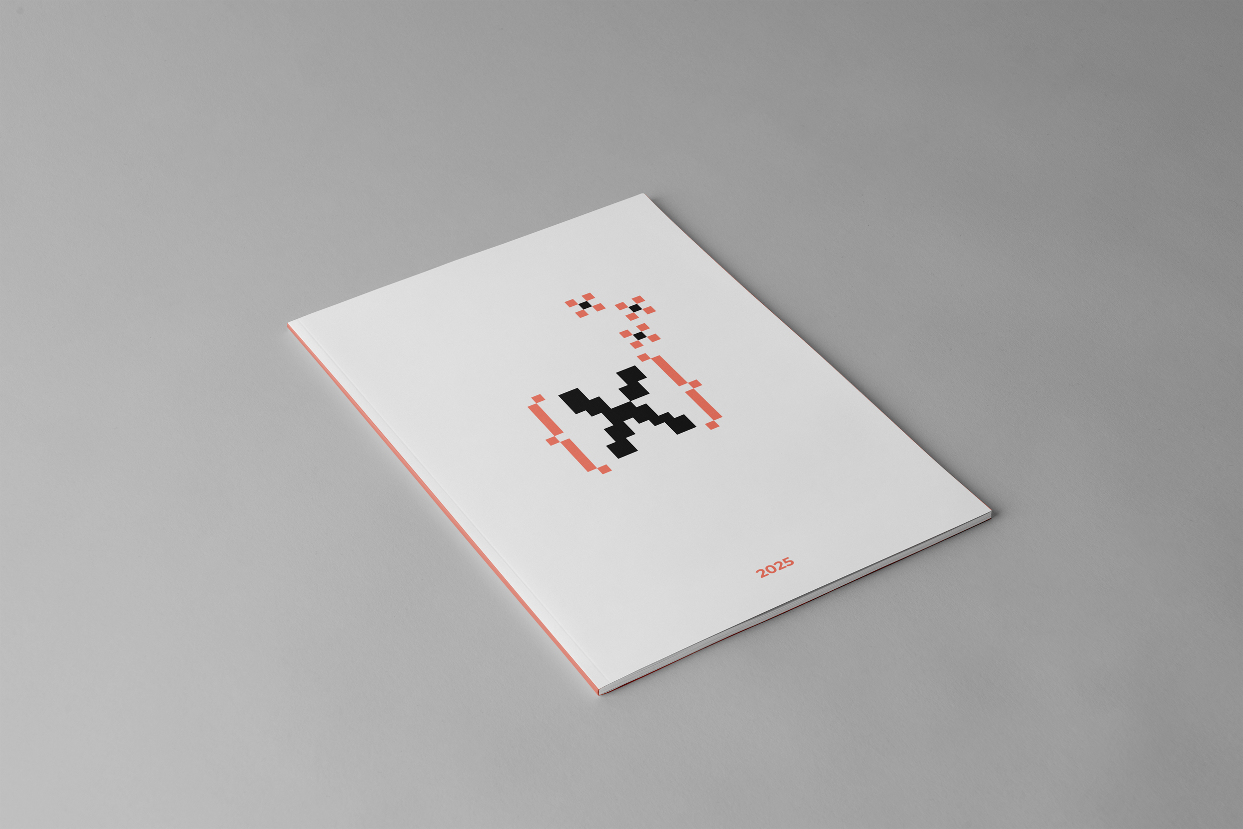
This gave Omkar Sane and Sane Difference both a concept and a visual language: the entire identity would be built pixel by pixel. Every typographic element, every graphic form, every surface pattern derives from a pixel grid — not as a retro-digital aesthetic but as a direct expression of how research lives in the world today.
The mark itself presented a specific problem. The X in XKDR stands for "cross" — as in cross-disciplinary — and the identity needed to make that intersection visible. The solution came from the clients' own intellectual world: mathematical brackets. Wrapping the X in curly braces — {X} — borrows notation that researchers encounter daily in equations and code, turning punctuation into architecture. The brackets hold the X visually the way interdisciplinarity holds XKDR's work conceptually: framing, containing, and giving structure to what would otherwise be an isolated letter.

The Brand World
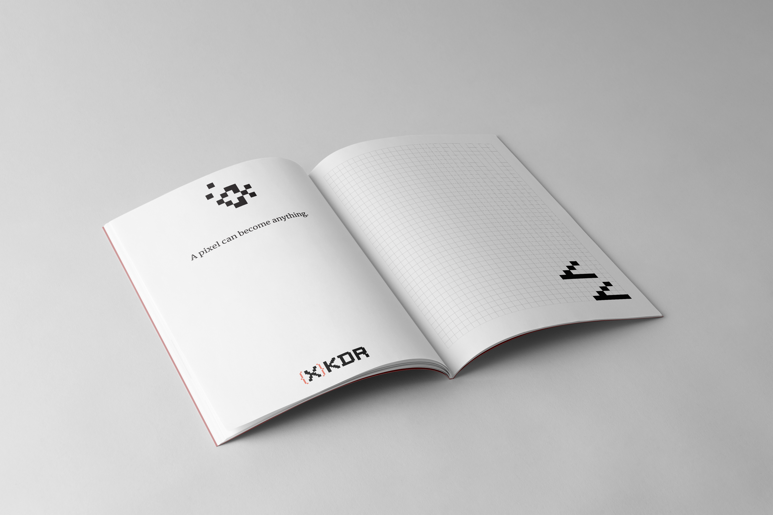
The pixel language extends from screen to surface. Event collateral, signage, and presentation materials carry the grid into physical space. A series of branded diaries takes the concept to its most literal and delightful point: ruled page lines are replaced with pixel grids, so the act of writing by hand on an XKDR notebook echoes the same unit of detail that structures the identity on screen. The collectibles function as both working tools and quiet arguments for the brand's founding idea — that rigour lives in the smallest unit of observation.
The Website
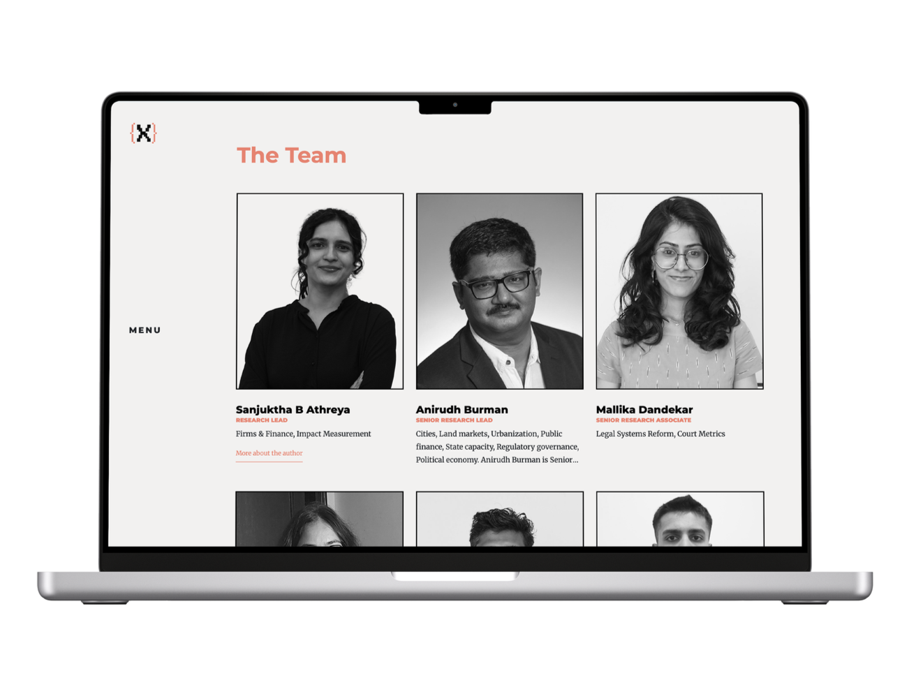
The digital platform organises a prolific and growing body of work — research papers, public discourse, data systems, seminars, conferences, viewpoints, and collaborations — into a navigable, content-first interface. The architecture sorts by field, by format, and by contributor, reflecting the way XKDR's own researchers think: across disciplines, not within them. The pixel identity runs through the site's visual grammar without overwhelming the content it serves, functioning as a research platform first and a brand expression second.